This rule has been archived
Deprecated
Controls - Do you use the fonts recommended by Microsoft in your application? (Windows Forms Only)
Loading last updated info...
Some font are easier to read then others, at SSW we follow Microsoft's Visual Design Guidelines. This means we use Tahoma 8pt as our font of choice.
Ensure all fonts on your forms are set to Tahoma but we allow controls to use a different font. This is because certain information is better displayed in a different font. For example a Textbox to show code should use Courier instead of Tahoma.
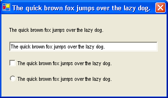
❌ Figure: Bad example - This form uses a non-standard font, and it is hard to read
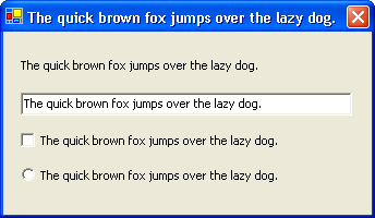
✅ Figure: Good example - This form uses Tahoma, and it is easy to read
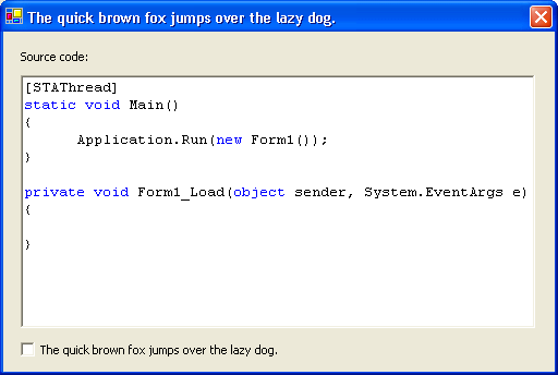
✅ Figure: Good example - This form uses Tahoma, and the RichTextBox displays source code using Courier New